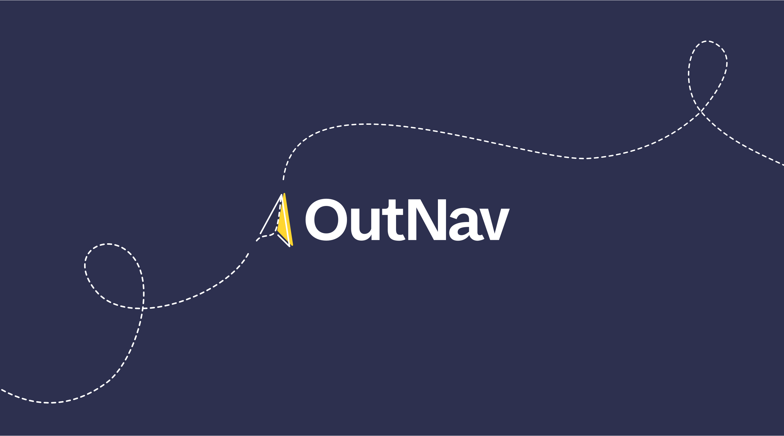
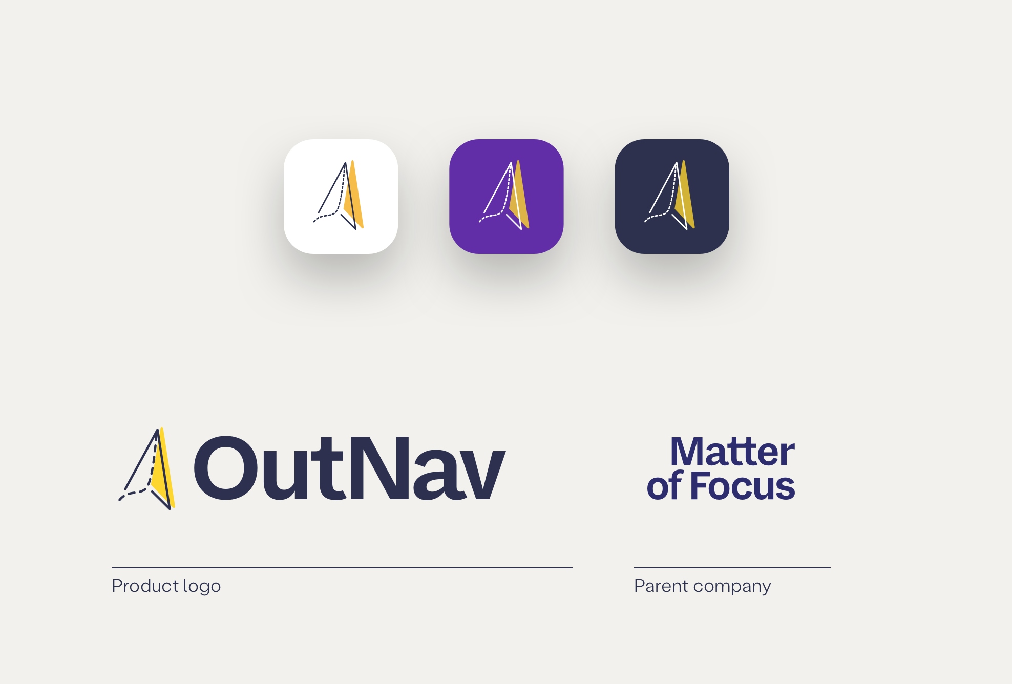
OutNav

OutNav is a powerful product transforming the way organisations evaluate outcomes and impact, being built by our long-term clients, and friends, Matter of Focus.

Together with their internal teams we work on everything from user research and user experience (UX), interface design (UI) and help them spec out and deliver new features and opportunities.

  • Product & User Experience
  • Culture & Social Impact
  • Technology
The “Outnav” logo sits in the middle of a dark blue background. To the left of a name is an outline of a paper plane icon. The plane’s twisted flightpath is denoted by a white broken line.
A coral background has four webpages on it denoting dashboards with blue blocks and illustrative text.
A purple background with a webpage with a white title ”Research Impact: Childline Research on sexual health” in the top of the page. There are small circular avatars for collaborators. There are five dashboard items under the title and pathway titles sit under that with illustrative text. An “Activity feed” site to the left of this.

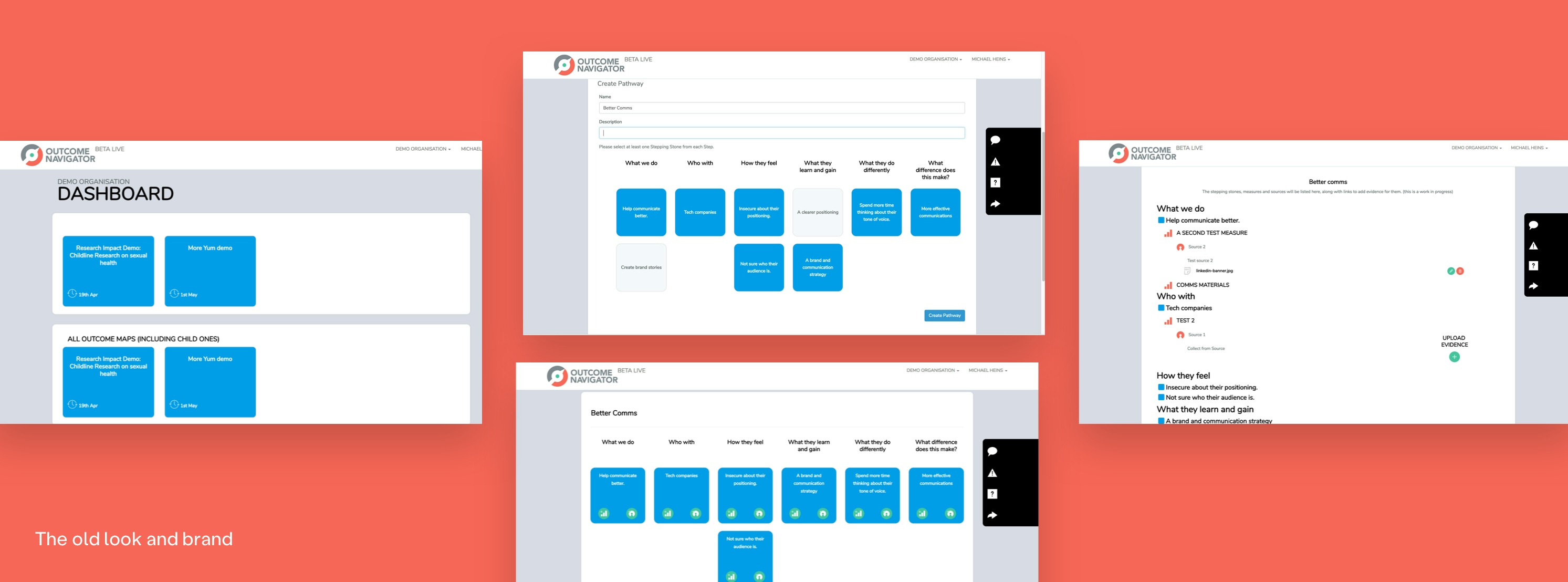
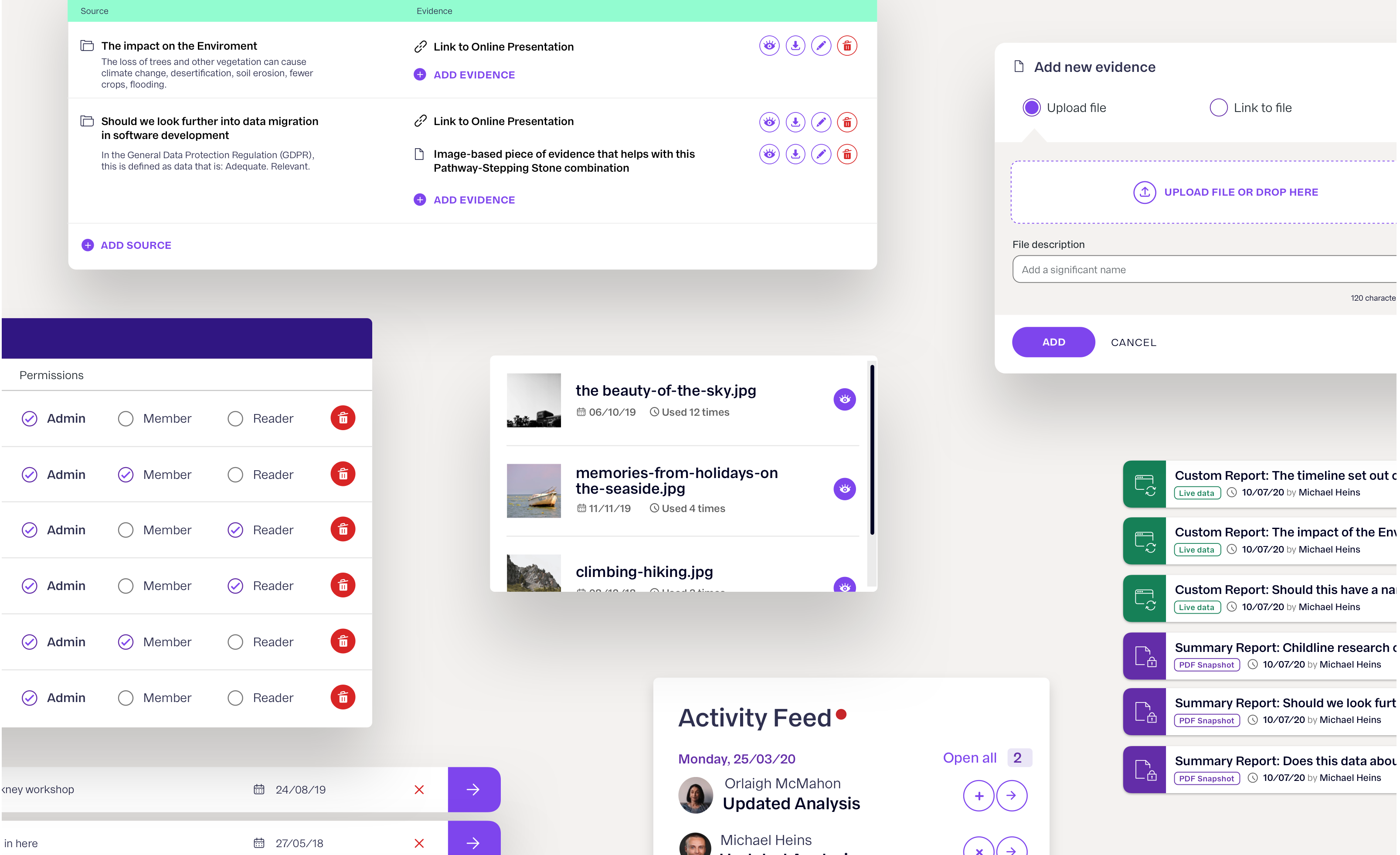
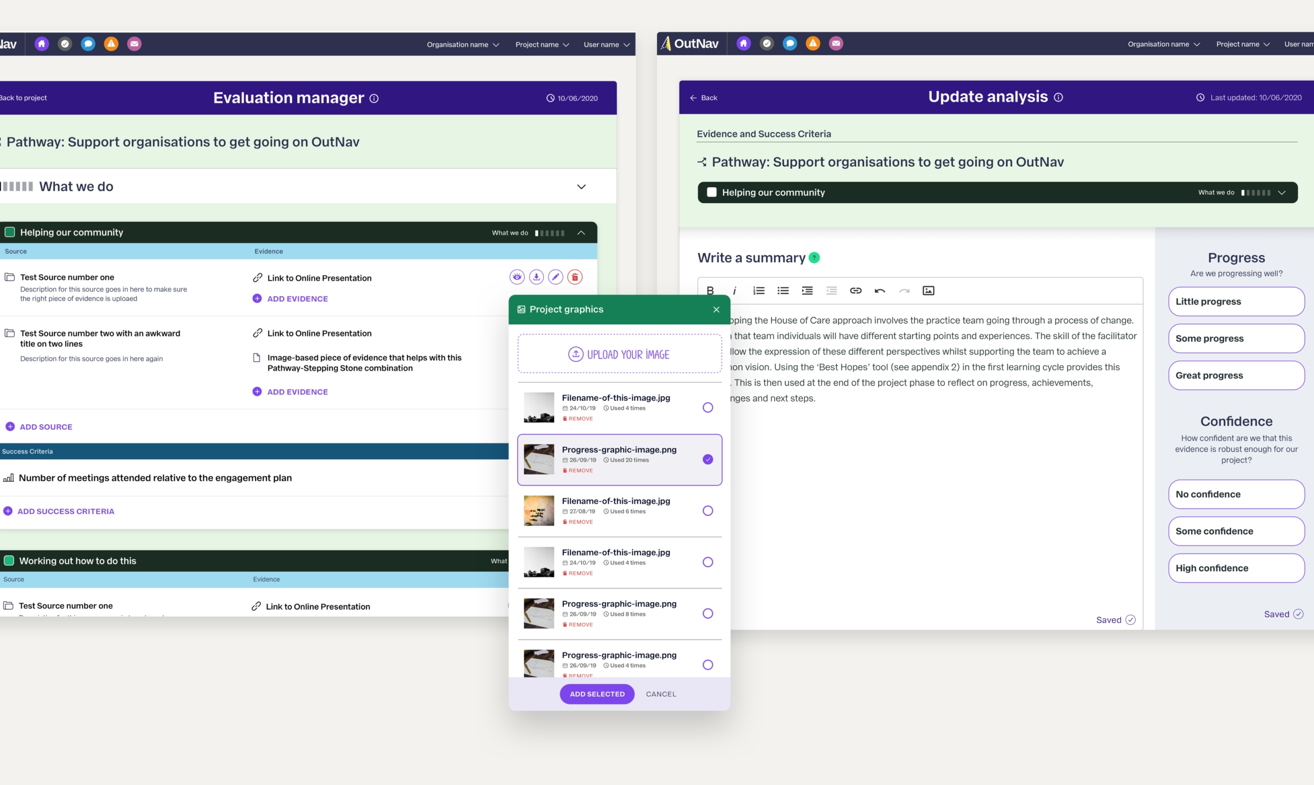
Projects in OutNav can run from a few months to years, so it is no surprise that the amount and variety of qualitative data is huge.

To tell better stories using this data, we are building and maintaining a dedicated product brand and library of components, styles and patterns for different use cases, views and scenarios. This includes anything from colours, and typography to wider applications such as user and permission management, file and evidence repositories and a task manager.

An offwhite image with three paper planes in individual square buttons in white, purple and navy sitting in the middle of the top third of the picture. At the bottom left is a paper plane with the “OutNav” logo. A small separator bisects this and a smaller “Product logo”. To the right of this is the “Matter of Focus” across two lines. A small separator bisects this and a smaller “Parent company”
A montage of various screens and webpage element images. Each page has a mix of descriptive texts and icons.
A purple background with a webpage with a white title ”Research Impact: Childline Research on sexual health” in the top of the page. There are small circular avatars for collaborators. There are five dashboard items under the title and pathway titles sit under that with illustrative text. An “Activity feed” site to the left of this.

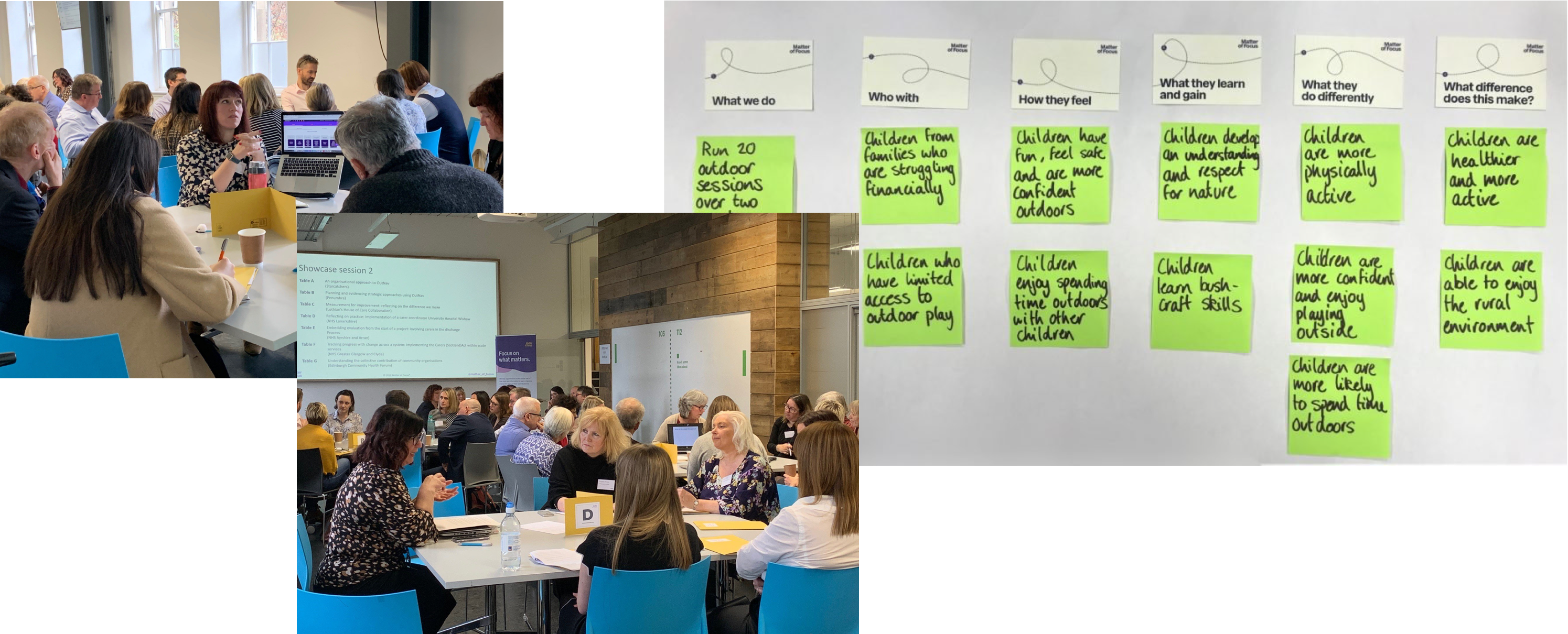
OutNav solves many complex problems for very specific people doing very intricate jobs. It would be arrogant to assume that we could just walk in and fix it all.

Instead, we spent a lot of time with the team and their clients, asking many questions and soaking up as much knowledge as possible.

A montage of three images. Two focus groups and an image of sticky notes in columns.
An infographic in purple displaying the restructured navigation.
A parent-child infographic in purple displaying the restructured progress reporting.
A pop-up in white prompts a user to do something on a greyed out web element.

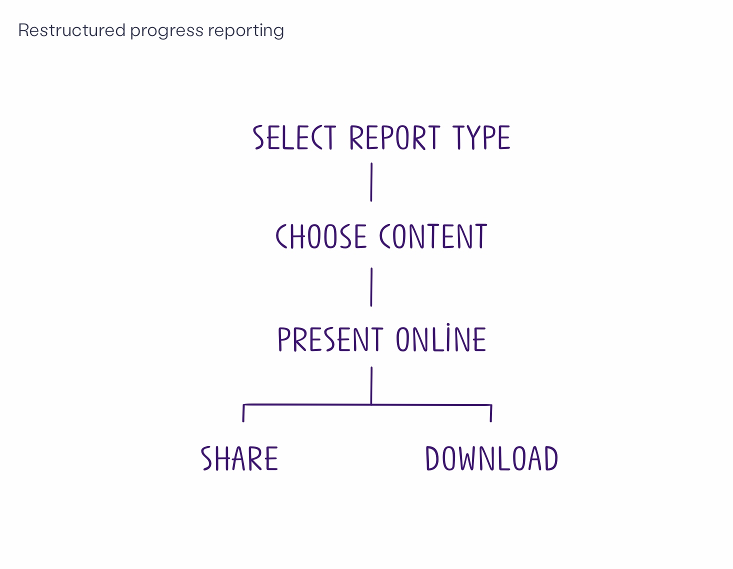
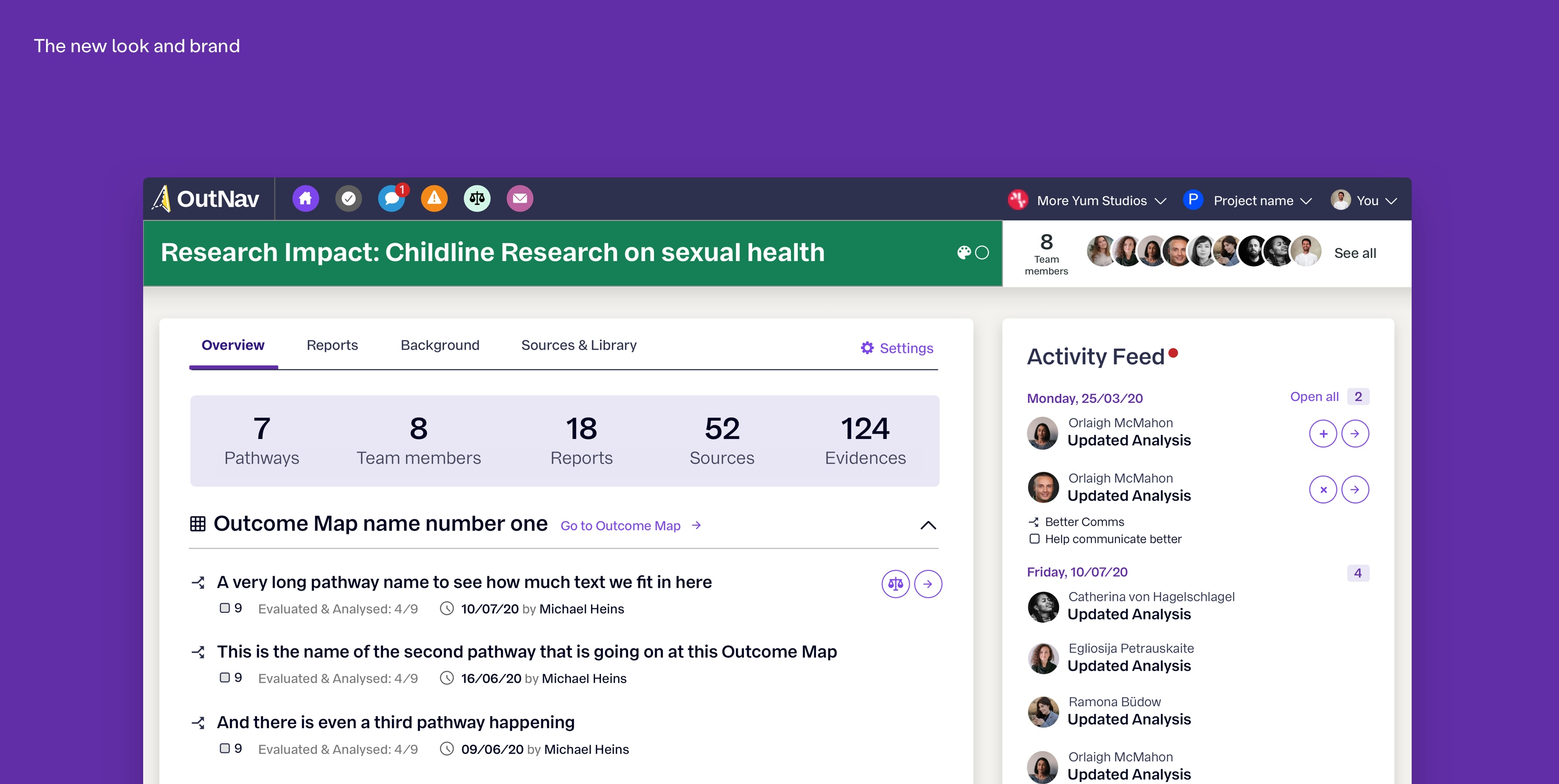
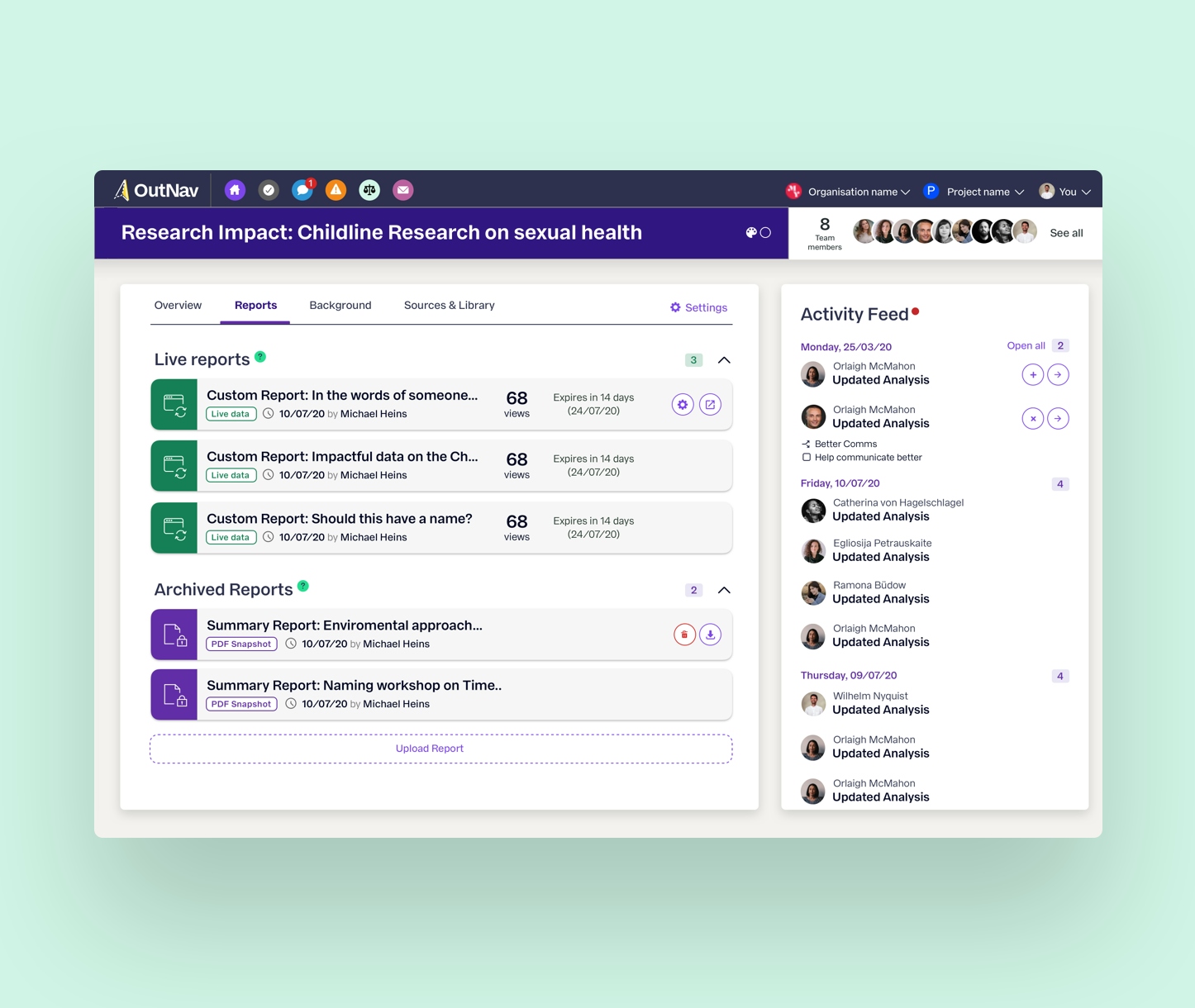
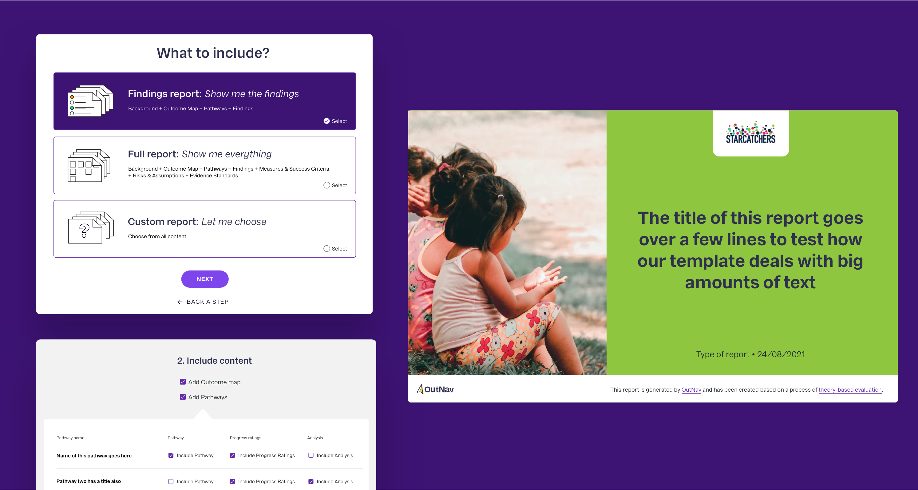
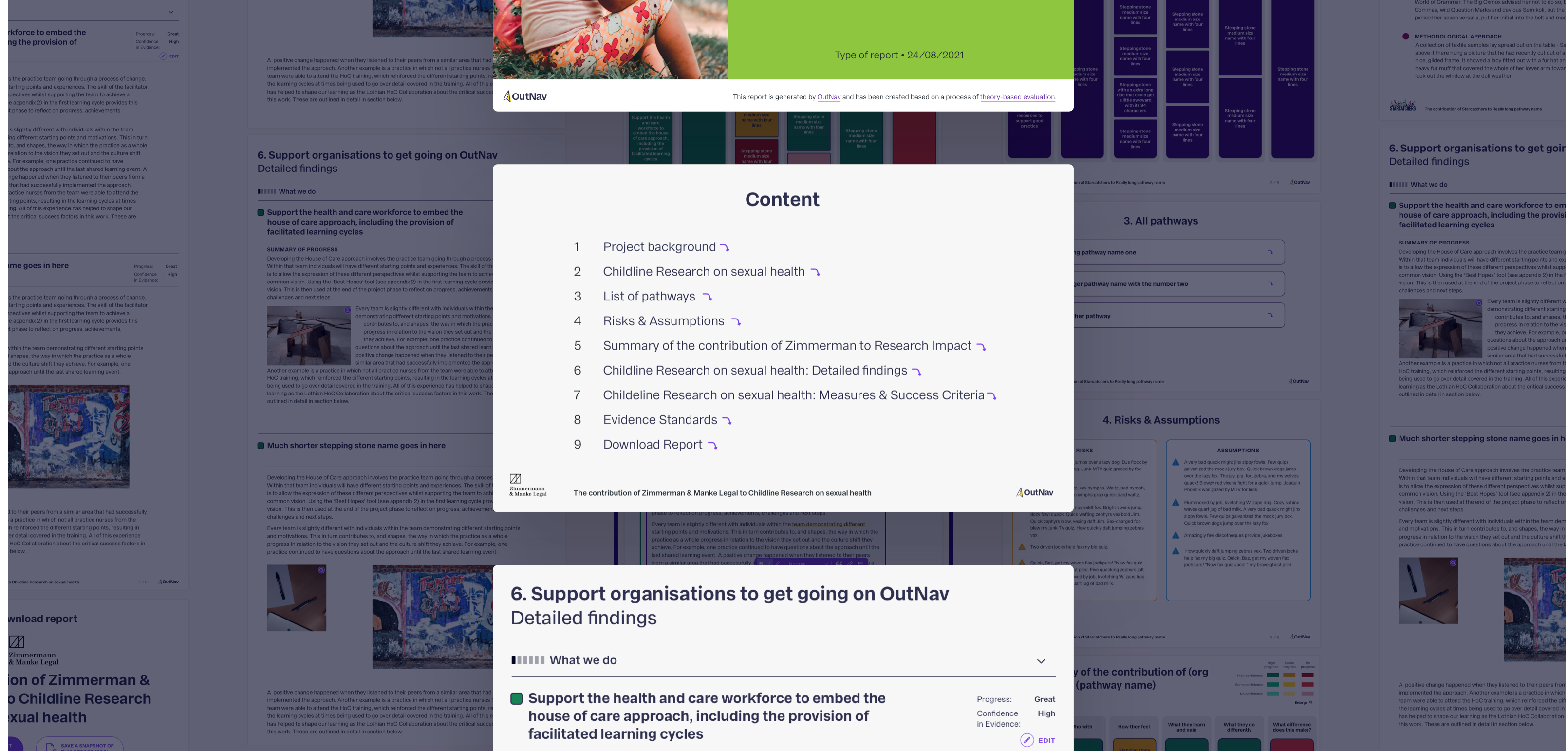
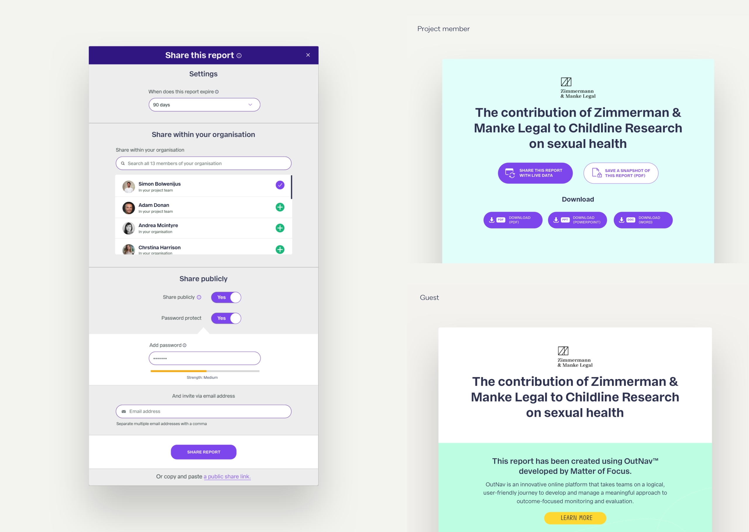
One of the big advantages of OutNav is the ability to create comprehensive reports easily.

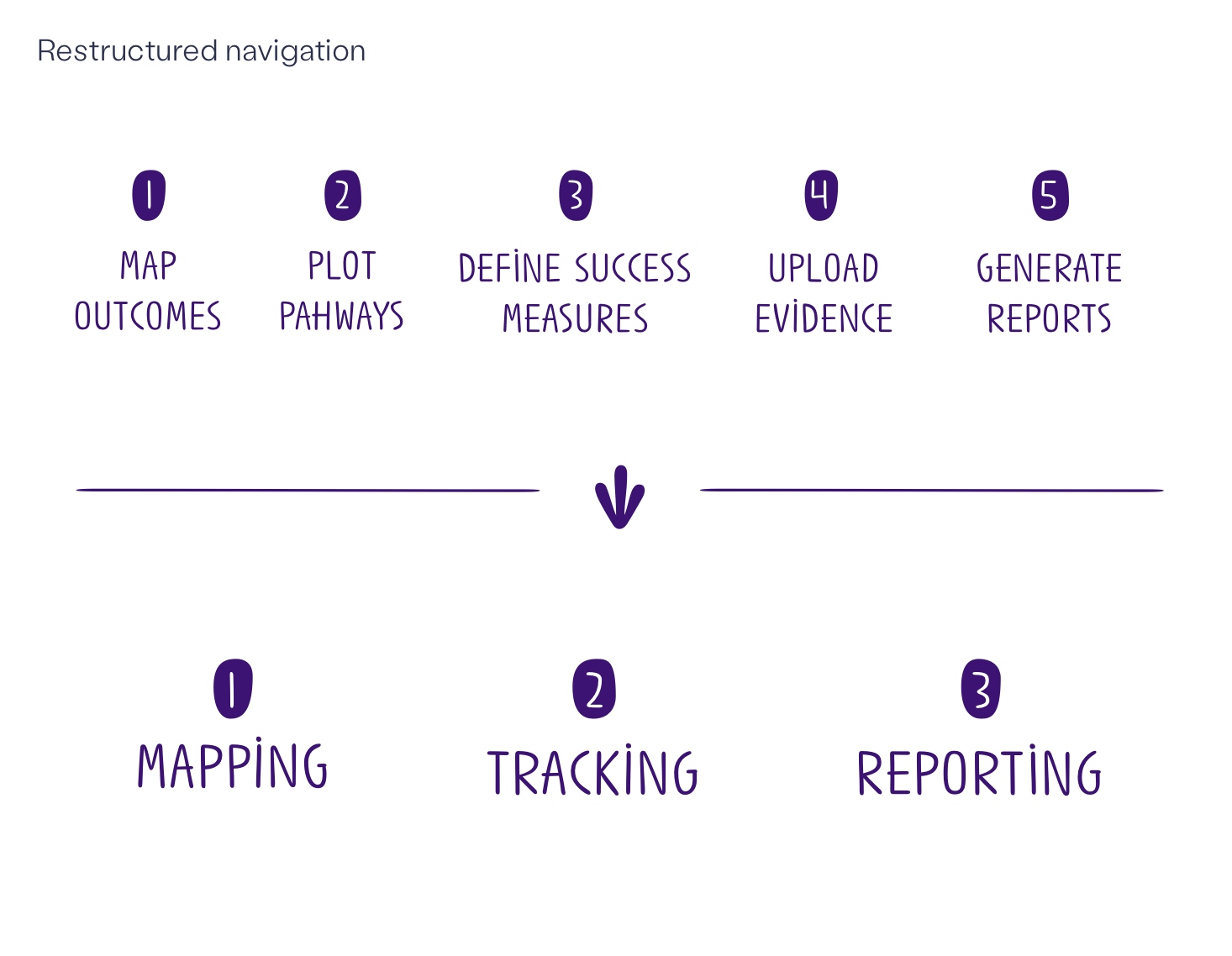
We restructured the way reports could be customised and shared, giving users the chance to include everything they need to speak to different audiences.

Two web report-creation elements sit on the left hand side of a purple background. On the right hand side, sits a presentation slide, which shows three small sitting children in profile. Next to this photo is a green image with purple text “The title of this report goes over a few lines to test how our template deals with big amounts of text”
A column of web elements sit in the middle of a background of greyed out web pages