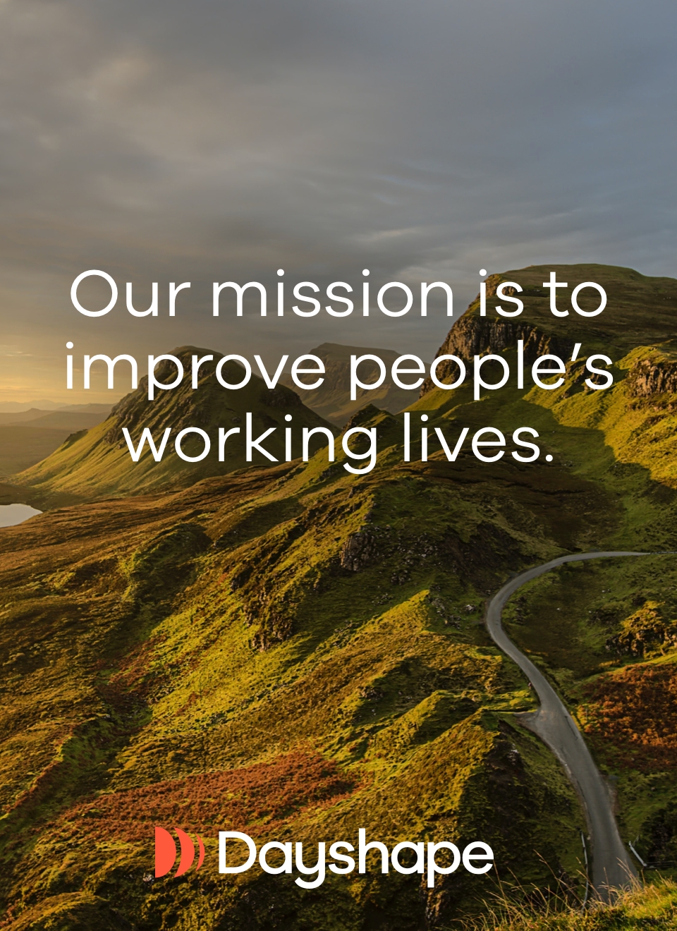
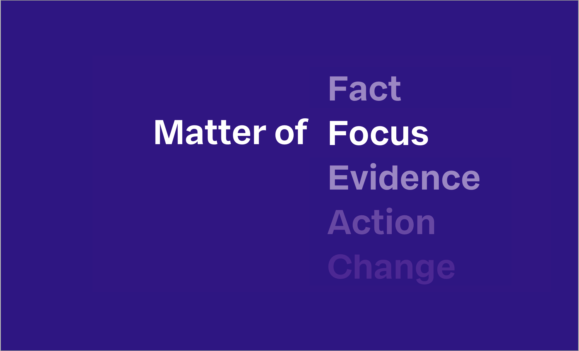
Matter of Focus
Matter of Focus is an Edinburgh-based technology and consultancy firm founded by Dr Ailsa Cook and Dr Sarah Morton. They are on a mission to help organisations improve outcomes for people and communities.
We helped them find a new name, designed their new brand, website and marketing materials.
- Brand & Strategy
- Website
- Culture & Social Impact
- Technology

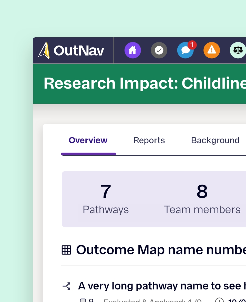
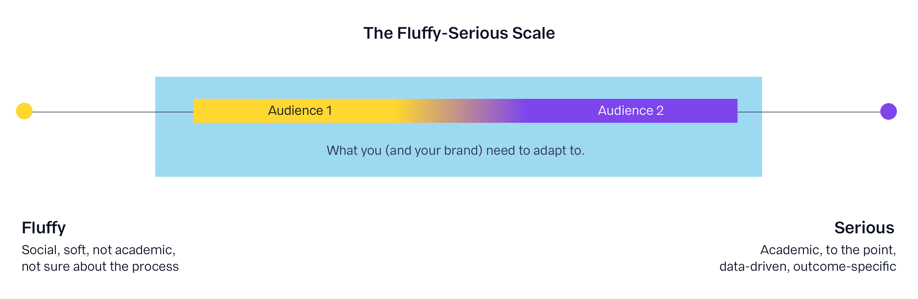
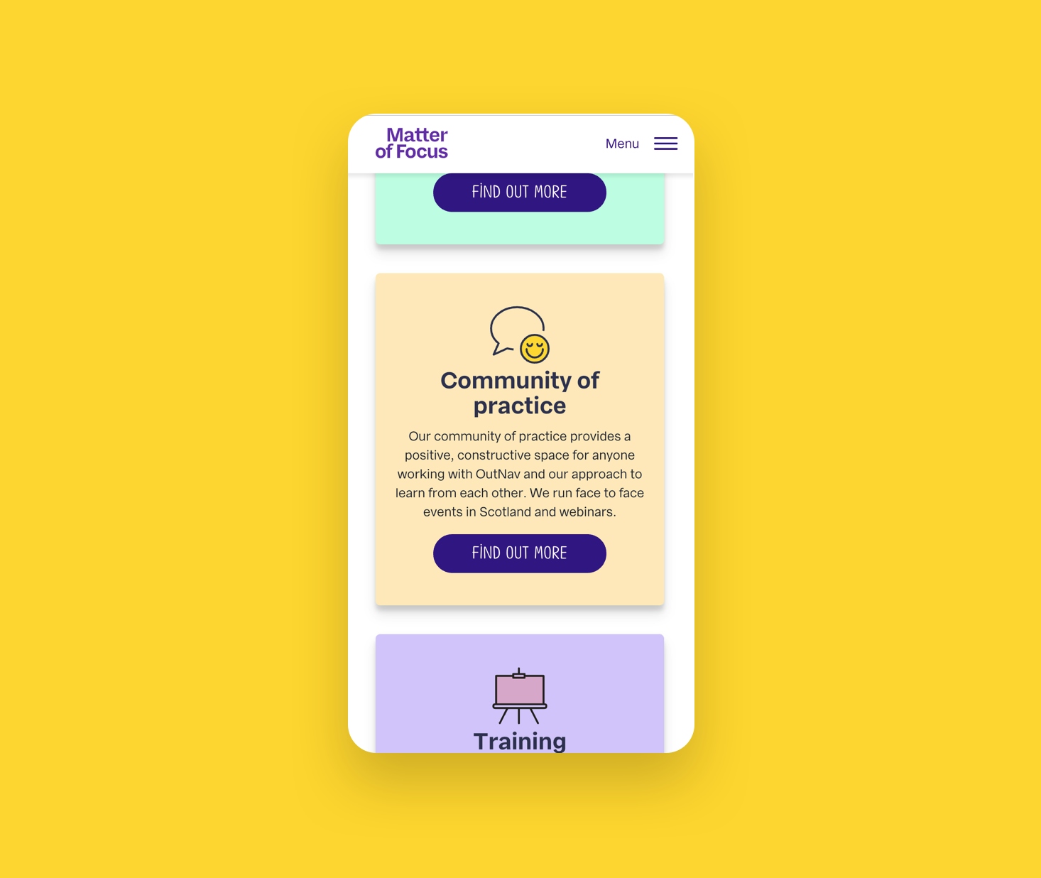
Matter of Focus are used to communicating to two different groups of people: The practitioners and the stakeholders. The practitioners are direct users of their methods, services and products while the stakeholders tend to make decisions on an organisational level without necessarily being hands-on contributors.
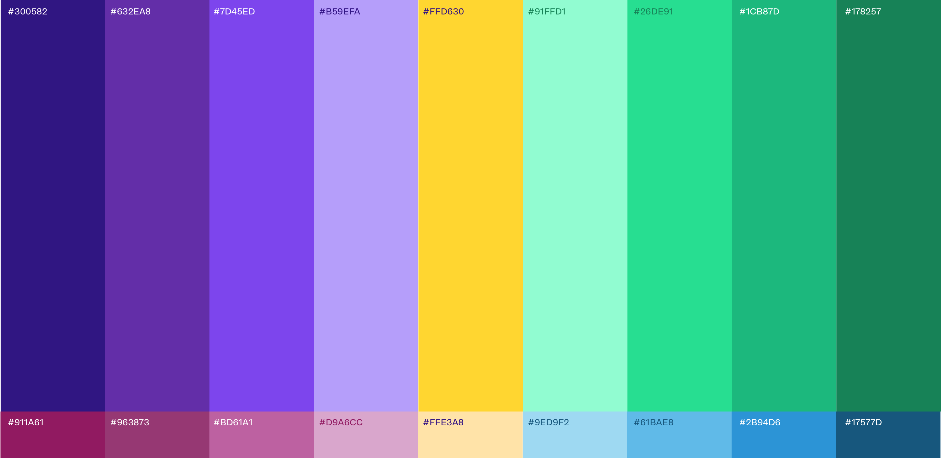
We established The Fluffy-Serious Scale to bridge the gap between the two different audiences and identify clear ways of communicating across the board.

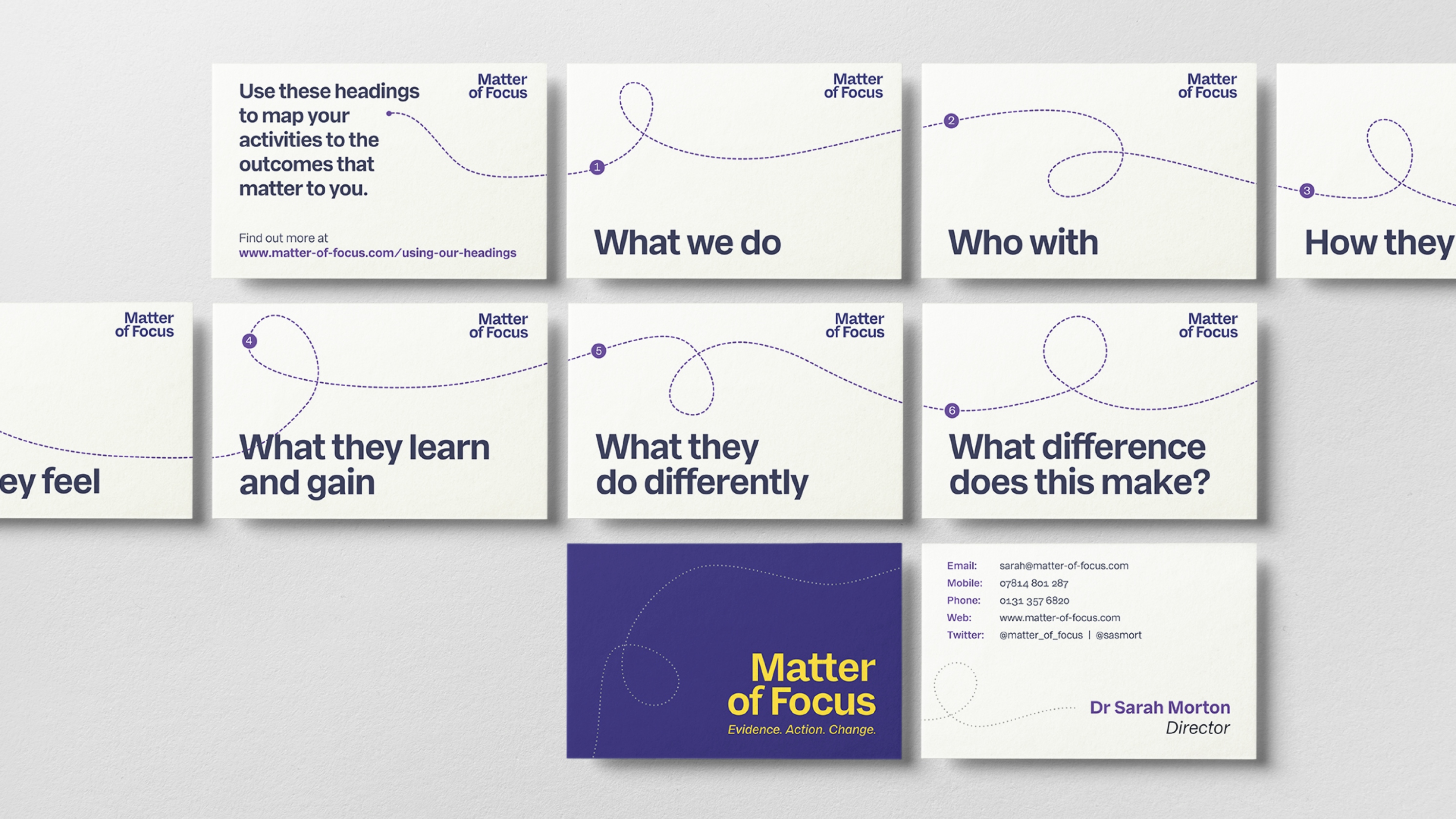
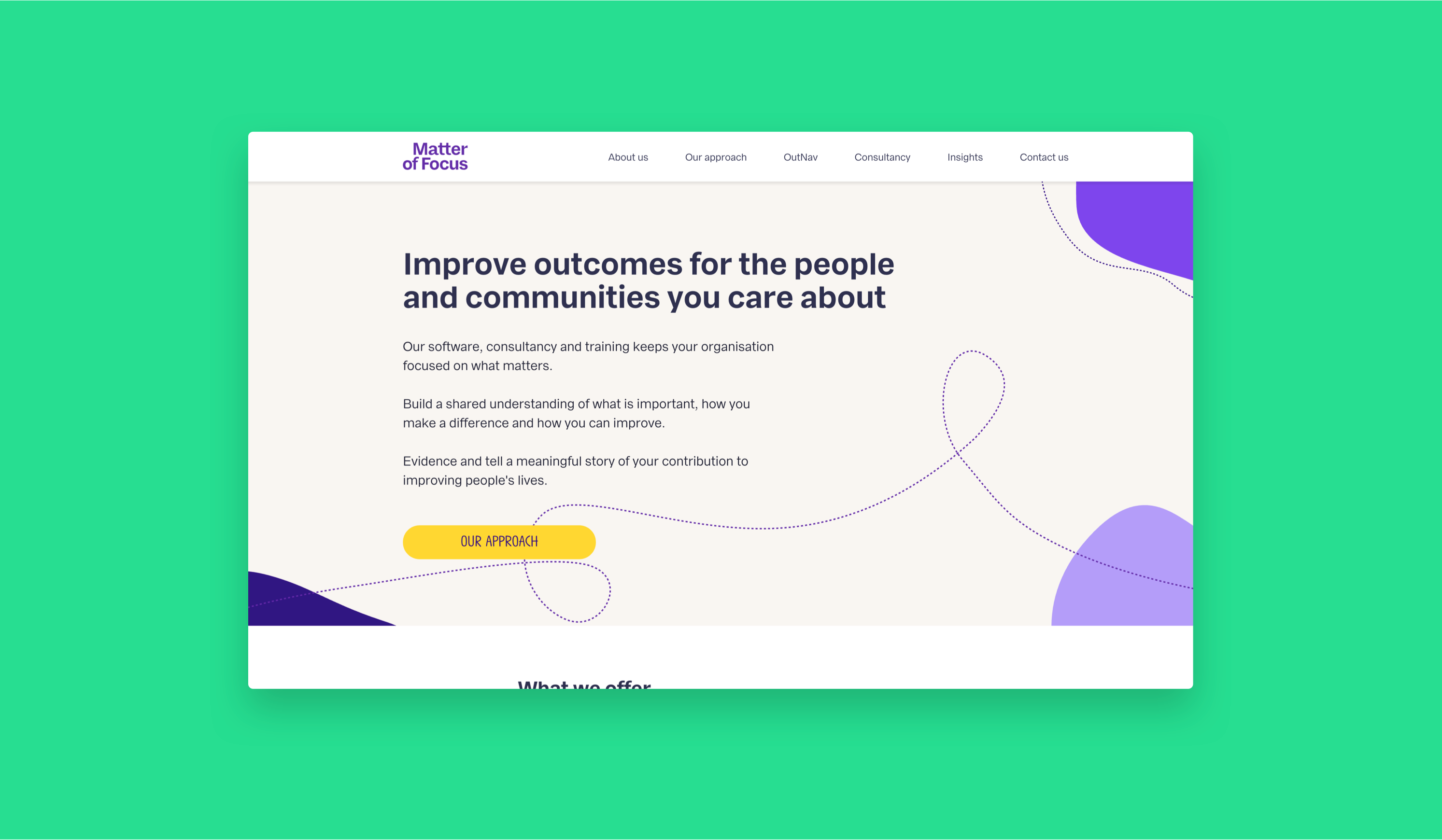
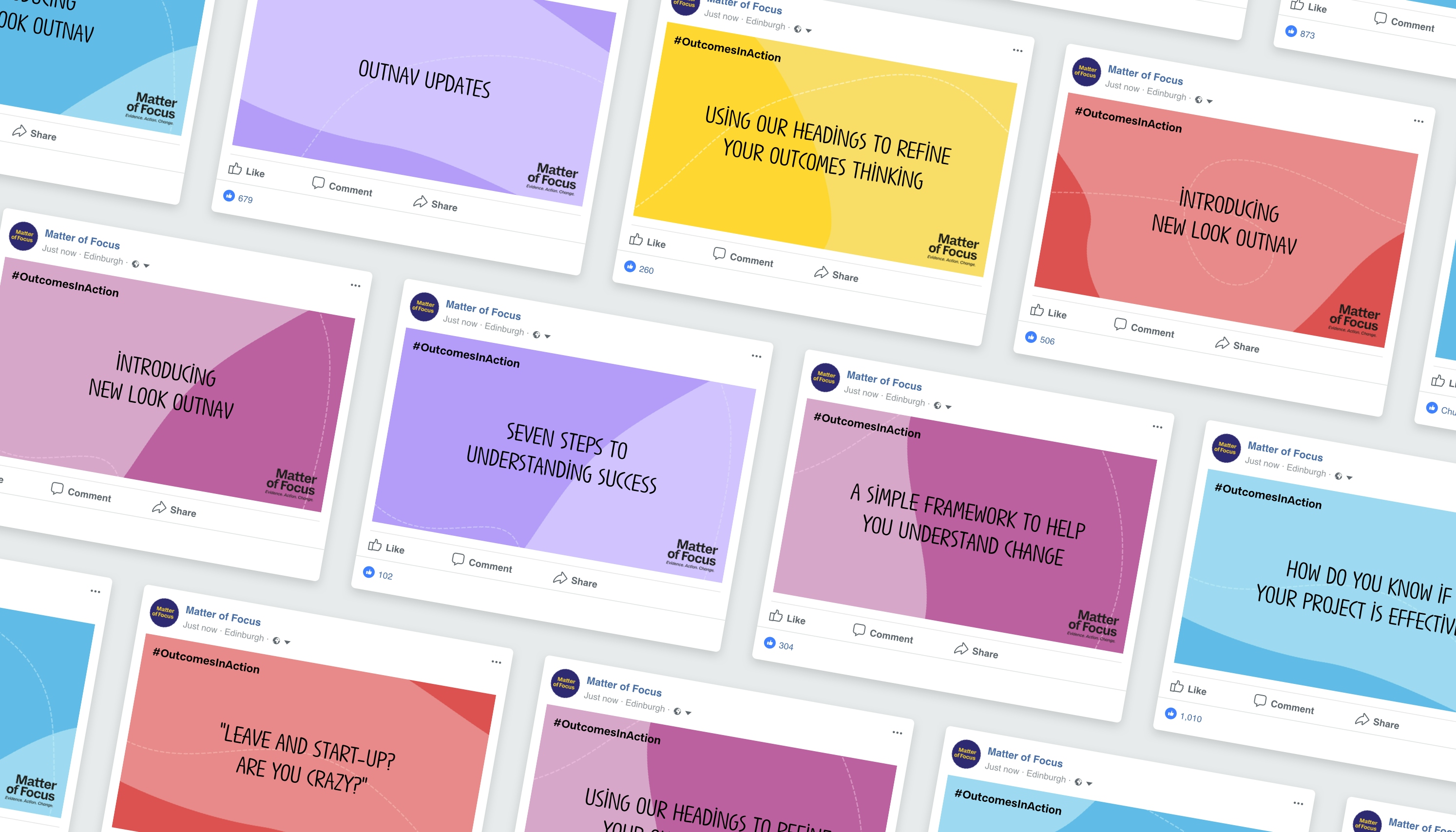
One of the main findings from all our conversations was the belief that Matter of Focus and their clients are in it together. Due to the nature of their work, there is no silver bullet to immediately finish a project; it is a guided journey they embark on together, often helping their clients to realign their direction as they go.
We decided to take this quite literally. The dotted line and freehand shapes push the hand-drawn and human approach whilst also showing a sense of direction. There is no clear beginning or end point, but a means of helping improve the process to arrive at a better solution.


Working with More Yum on our rebranding was just brilliant. They took us on a really enjoyable, challenging and exciting journey to considering what kind of company we are, what we want to communicate to the world and what that means for our name and branding. At the end of that process we have a name, branding and overall look and feel that we love and that our clients have responded really positively to. What is more, going through the process has helped us hone in on what makes our company special, which is invaluable as we implement our content marketing strategy.